 Debashish Ghatak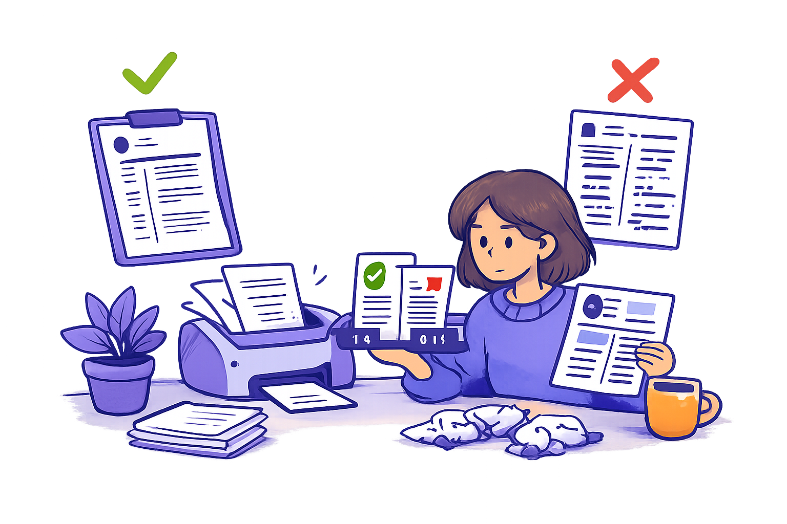
You found a two-column template that finally looks like you. Clean sidebar, skills down the left, a little color. You spent an evening lining it up. And now there's a nagging voice: will this even make it through the software?
Fair question. The short answer: some two-column resumes parse fine, and some get scrambled into nonsense — and the difference isn't visible to your eye. It's in how the file is built underneath. Below is what actually happens when an ATS reads columns, a quick test you can run yourself, and how to look professional without gambling on it.
How ATS software reads your resume today
An applicant tracking system (ATS) is the software companies use to organize applicants — Greenhouse, Ashby, Workday, Workable, and plenty of regional ones. When you upload a PDF, the ATS doesn't see your resume the way you do. It parses the file: it reads the text in a sequence and tries to sort each piece into a bucket — this is a company name, this is a date, this is a bullet, this is a skill.
That parsing step is the whole ballgame. If the parser reads your text in the right order, your resume ends up as a clean, searchable profile a recruiter can scan. If it reads it in the wrong order, your experience arrives jumbled — and a non-expert recruiter scanning fast (they usually aren't a specialist in your field) has a harder time following your story.
Worth clearing up one myth first: there's no "ATS score" the software spits out, and the resume parser doesn't reject you on its own. We dug into that in whether ATS systems actually reject your resume. The real risk with columns isn't rejection — it's your content arriving unreadable.
Do ATS systems read columns correctly?
Here's the core principle. Most text sits on a page in an invisible reading order. For a single column, that order is dead simple: top to bottom. For two columns, it depends entirely on how the layout was constructed.
- If the file is built so each column is its own clean block, many modern parsers read the left column fully, then the right — fine.
- If the columns are stitched together with text boxes, tables, or floating frames, the parser can read across the page instead of down it — picking up one line from the left, one from the right, mixing them into gibberish.
So "does ATS read columns?" has no single yes/no. It reads the reading order the file hands it, and two-column layouts are far more likely to hand it a bad one. That's the honest version of the single vs two-column resume debate — not "columns are banned," but "columns raise the odds something breaks silently."
Common two-column resume mistakes
These are the construction choices that turn a nice-looking template into a parsing problem:
- Text boxes and floating frames. The sidebar that looks separate is often a floating box the parser can't place in order.
- Tables used for layout. Columns built as table cells frequently get read left-to-right across rows, splicing unrelated lines together.
- Icons instead of labels. A little phone glyph next to your number means nothing to a parser. Same for skill-rating dots and progress bars — they carry zero text.
- Headers and footers for key info. Contact details or your name tucked in the document header sometimes get dropped entirely.
- Decorative fonts and graphics. Pretty to the eye, noise to the parser. If you're picking type, our guide to resume fonts that pass ATS covers what reads cleanly.
The theme: anything that makes a resume look designed often makes it parse worse. Recruiters mostly don't care about beauty — they want content that's easy to read and follows the norms of the role and region.
How to make a two-column resume more ATS-friendly
If you're set on two columns, you can lower the risk:
- Build columns as real columns, not tables or text boxes. If your tool lets you insert a proper two-column section, that's safer than drawing boxes.
- Keep the core career story in the main column. Experience, titles, dates, and bullets belong in the larger column read top-to-bottom. Reserve the sidebar for low-stakes items: skills keywords, languages, certifications.
- Use plain text labels. Spell out "Email," "Phone," "Location" — no icons doing the work.
- Put contact details in the body, not the header or footer.
- Export as a text-selectable PDF, never a flattened image. If you can't highlight the text with your cursor, neither can the parser.
Even done perfectly, a two-column layout is a bet. Which brings us to the test.
How to test whether your resume parses
You don't have to guess. Run this in two minutes:
The copy-paste test. Open your PDF, select all the text (Cmd/Ctrl+A), copy it, and paste it into a plain text editor. Read what comes out. This is roughly what the ATS sees.
What you're looking for:
- Does your text read in order — name, then summary, then each job top to bottom?
- Are dates still next to the right company?
- Did any sidebar content splice itself into the middle of a bullet?
- Did your contact info survive?
If the pasted text reads like your resume, you're in good shape. If it reads like a shuffled deck — "Marketing Manager Python Jan 2022 TechCorp Spanish led a team" — your columns are breaking the parse.
What the parsing test actually tells you
A clean paste means the reading order is sound and the parser can bucket your content. It does not guarantee interviews — no formatting trick does, and we won't pretend otherwise. It just removes one silent way to get overlooked: a recruiter searching their ATS for "project management" never finding it because the phrase got scrambled across columns.
A messy paste is the clearest signal there is that your layout is costing you. If you've been applying steadily with no response, parsing is one of the leaks worth ruling out — we walk through the others in why you might not be getting interviews. Formatting is rarely the only issue, but it's the easiest one to fix.
Single-column layouts that still look professional
Here's the reassuring part: single-column resumes don't have to look plain. A clean single column with clear section headings, consistent spacing, a legible font, and — where it helps — a few bolded numbers so a recruiter can scan your impact fast, looks sharp and parses every time.
The real work of a strong resume isn't the sidebar anyway. It's that your bullets show impact, not a task list — the single most common first-resume mistake. Fixing that beats any layout tweak. If your bullets read like a job description, start with turning responsibilities into achievements and, if you're short on hard metrics, how to quantify a resume without numbers.
DashApply's resume formatting gives you three single-column, ATS-friendly templates — Classic, Modern, and Compact — so you get a clean, parseable layout without building one from scratch or risking a column scramble. You can see the full set of formatting features and edit every line before you export.
When a two-column resume is actually fine
Two columns aren't universally wrong. They make sense when:
- You're applying somewhere a human reads first and an ATS isn't in the path — a small company hiring directly, a warm referral, a design or creative role where layout is part of the pitch.
- Regional norms differ. There's no single global "correct resume." Some regions accept photos and denser layouts that North American recruiters would skip. Match the market you're applying into.
Even then, keep a single-column version ready for everything that routes through an ATS. Having both costs you nothing.
Before and after: fixing a two-column resume
Say your current resume has a left sidebar with contact info, a skills bar chart, and languages, and a right column with experience.
Before (parse risk): contact in a floating box, skills shown as dots, experience in a table-based right column. Copy-paste test returns a jumble.
After (ATS-safe): one column. Name and plain-text contact at the top. A short summary. Experience with company, title, dates, and impact bullets, top to bottom. A simple comma-separated skills line near the bottom, pulled from the actual job posting. Copy-paste test reads perfectly.
The second version isn't a downgrade. It's the one a recruiter — and their software — can actually read. And because the skills line is drawn from the posting, it does double duty for keyword matching. A job-description keyword finder can show you exactly which terms to include, and DashApply's gap analysis shows the skills a specific role wants plus a live match score before you apply.
FAQ
Are two-column resumes ATS-friendly? Sometimes. A two-column layout built cleanly can parse, but it raises the odds of a scrambled reading order compared to a single column. If you use one, run the copy-paste test first — and keep a single-column version for roles that route through an ATS.
Does an ATS read columns left-to-right or top-to-bottom? It depends on how the file is constructed. Clean column blocks are usually read one column at a time. Columns built from tables or text boxes often get read across the page, splicing unrelated lines together.
How do I test if my two-column resume breaks the ATS? Open the PDF, select all, copy, and paste into a plain text editor. If the text reads in order with dates beside the right jobs and nothing spliced, you're fine. If it's shuffled, your layout is the problem.
Is a single or two-column resume better for ATS? Single-column is the safer default — it parses reliably and still looks professional with good headings, spacing, and a few bolded numbers. Choose two columns only when a human reads first or regional norms call for it.
Will columns make the ATS reject me automatically? No. The ATS doesn't score or auto-reject your resume for formatting. The real risk is your content arriving unreadable, so a recruiter searching for your keywords never surfaces you. The one genuine auto-reject is knockout questions on the application form, not your layout.
Format it clean, then tailor it
The honest takeaway: two columns can work, but they're a bet you don't need to make. A clean single-column resume reads perfectly for both the parser and the human who opens it next — and frees you to spend your energy on the part that actually earns interviews: saying clearly, in impact terms, what you've done.
DashApply handles the formatting with ATS-friendly templates, then tailors your resume to each role grounded in your real experience — you review every line before you download. It's free during early launch, no credit card. Upload your resume and see it in a clean, parseable layout, or check the pricing first.
Sources: U.S. Bureau of Labor Statistics on job search methods, Greenhouse resume parsing documentation.